Are you interested in doing research with social media data? If so, you might be interested in a workshop I have organised (as a BSA Digital Sociology Group event) which will be a basic introduction to using the software programme NodeXL for social scientists. This will be at Leeds Beckett on 9th January 2017 and you can register through the BSA website (£15 BSA members, £20 non-members). The workshop will be led by the excellent Wasim Ahmed who is a PhD researcher in the Information School and a Research Associate at the Management School at The University of Sheffield and also a social media analysis consultant. The session will give you a grounding in using NodeXL to analyse Twitter (and potentially other networks) and suggest some ways it is of particular use to social scientists.
NodeXL (the free version of which can be downloaded here) is an add-on for Microsoft Excel which enables you to extract data from social networks and analyse connections between users and the overall qualities of the network. So for instance, if you are interested in Twitter the software allows you to extract tweets which which use a particular hashtag (in bulk) and construct a visualisation of this network in relation to different ways of measuring the character of the connections between users and how they have tweeted.
While NodeXL is quite easy to use it can be tricky (and time consuming) to teach yourself from scratch. So if you are interested in a basic introduction this workshop could be very useful. It will be for me!
In this post I will attempt to demonstrate some of the things which NodeXL can do and suggest why social scientists might find it useful. However, I am far from being an expert with it and the little I know is what I have taught myself from playing around with it, reading guides and watching Youtube tutorials. So, this post should not be considered to be an authoritative guide or introduction to the software and may well be riddled with errors. However, it may be of some use as a a very general introduction to the kinds of things which can be achieved.
Durkheim on Twitter
So by way of an example I decided to look at who was tweeting using #Durkheim (Émile Durkheim is one of the founding figures of sociology) and to construct a graph to visualise the connections between those using this hashtag. In the process we get an unexpected appearance from Kim Kardashian.
After importing the data from Twitter I get an excel spreadsheet which is filled with all kinds of information about those using #Durkheim. Below you can see the top of the spreadsheet displaying the “vertices” or twitter handles (or users). The first 15 are displayed here but there are a total of 1529 in the network.
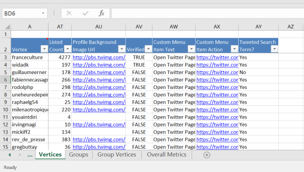
Top vertices (betweenness centrality) #Durkheim
It is also possible display the “edges” or connections between Twitter users which in this case means instances when one Twitter user has “tweeted at” another using #Durkheim. The first 12 are displayed below but there are a total of 1574.
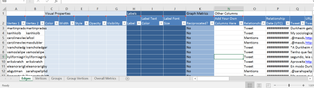
The “vertices” (Twitter users) and “edges” (connections between Twitter users) are the basic elements of the graph but things start to get a bit more interesting when we visualise the network.
Visualising Twitter data
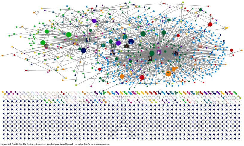
Below is a basic network. The circles represent the “vertices” (or Twitter users) and the lines represent the “edges” (connections between Twitter users) and the arrows on the lines show the direction of the edge (who is tweeting at who).
There are various ways in which to arrange the graph in relation to different kinds of measures. One of the most useful (which I have used for the graph above) is “betweenness centrality”. This is one of several measures of centrality which broadly tell us how “central” a particular vertex is to the network. In particular “betweenness centrality” gives us information on the role which a particular vertex plays in connecting other vertices. So a vertex which has a high level of “betweenness centrality” would serve as a bridge between many other vertices. We could see this as the Kevin Bacon measure.
In the graph above the larger the vertex is the higher factor of “betweenness centrality” it has. So the largest vertices are the ones with many connections to others and act as a bridge between many other vertices. I have also represented the ten vertices with the highest “betweeness centrality” with the image on their Twitter profile.
In my Durkheim graph the vertex with the highest “betweeness centrality” is the Twitter user “franceculture” with a factor of 198142.212281. The average “betweeness centrality” for the graph is 268.184, so clearly the measure for “franceculture” is significantly more. Below are the overall “graph metrics” which I won’t go into but you can compare the measures I have just mentioned against the averages or totals for the graph as a whole.
| Graph Metric | Value |
| Graph Type | Directed |
| Vertices | 1529 |
| Unique Edges | 1574 |
| Edges With Duplicates | 250 |
| Total Edges | 1824 |
| Self-Loops | 763 |
| Reciprocated Vertex Pair Ratio | 0.017874876 |
| Reciprocated Edge Ratio | 0.035121951 |
| Connected Components | 719 |
| Single-Vertex Connected Components | 523 |
| Maximum Vertices in a Connected Component | 463 |
| Maximum Edges in a Connected Component | 706 |
| Maximum Geodesic Distance (Diameter) | 10 |
| Average Geodesic Distance | 2.883498 |
| Graph Density | 0.000438726 |
| Modularity | Not Applicable |
| NodeXL Version | 1.0.1.360 |
We can look at some other measures to understand something about the specific character of the influence which “franceculture” has in this network. For instance, we can see their “In-degree” and “Out-degree”. “In-degree” measures how many “edges” point towards the node and “Out-degree” how many edges point out from the node.
So when analysing a twitter network “In-degree” tells us how many times the twitter user “franceculture” was “tweeted at” and “Out-degree” how many times they tweeted someone else using #Durkheim. In this case the “In-degree” was 330 and “Out-degree” 3. So they were “tweeted at” many more times than they tweeted at other people.
The visualisation of the #Durkheim graph above looks quite nice and can give us some sense of the character of the network (it clearly shows that “franceculture” is important in the network) but it is quite limited overall in what it can show us.
Understanding the structure of the network
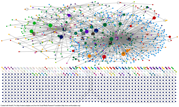
NodeXL also lets us lay out the graph in lots of other formats. One useful function is to arrange the graph in boxes according to “clusters”. This helps us to see some other features of the network.
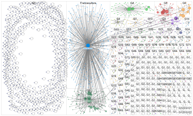
In the graph above we can still see that “franceculture” is the most influential vertex (the top, middle box) but it is clearer how other vertices are connected to it and in particular the way in which it dominates a particular area of the graph. It is a bit difficult to make out because of how densely packed the lines are but you can just see that all of the arrows are pointing from smaller vertices to the “franceculture” one meaning that they all “tweeted at” “franceculture”. It is easier to see this with a vertex which is less popular like “widadk in box “G4”.
The network around “franceculture” is an example of a “star network” in which one vertex is right at the centre of the action with other vertices only connected to the central vertex. This can also be described as a type of “broadcast network” and specifically an “in-hub & spoke broadcast network“. Both of these descriptions are trying characterise the way in which a single vertex (the “franceculture” Twitter user) is central to the network and (as suggested by the “broadcast network” label) that it is controlling the conversation within its group. As all of the other vertices within the group only refer to “franceculture” and not to each other then whatever “franceculture” has to say becomes very significant.
So why is “franceculture” so important in the discussion of Durkheim? And what does this have to do with Kim?
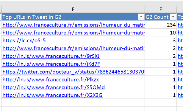
We can get an idea of this from looking at the “Top URLs” in this group, that is, the links which were being used by those “tweeting at” “franceculture”.
Émile and Kim
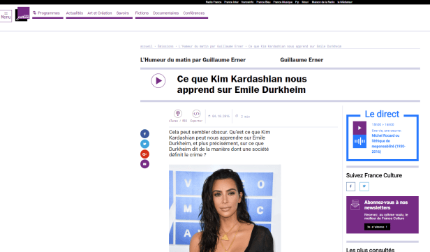
The top URLS in the group are pointing towards a page on the France Culture website. France Culture is a public radio station in France which focuses on history, politics, sociology, etc. The particular page is a summary of a radio show in which a sociologist is using recent reports of the theft of jewellery from Kim Kardashian’s home to explain Durkheim’s sociological approach to understanding crime.
So, what does this tell us?
- Individual Twitter users can be very influential in a network and go a long way to defining what is said about a particular issue (in this case what is said about Durkheim) on the network
- Although Twitter is often seen as an open, democratic medium in which anyone can get involved and be heard it is often dominated by particular users who dominate the conversation. Also, the users who are highly central are often “old media” players (like France Culture who have been on the air since 1946)
- If you want to get people talking on Twitter about important sociologists who have been dead for 100 years it is useful to associate them with celebrities and social media stars!
If you want to do some social media analysis like this (but probably a lot better than my attempt) then have a think about coming to the workshop in Leeds in January. Get in touch with me if you want any more info. In the meantime there are some really good overviews on NodeXL and what it can do from Wasim (with more on his blog), on the Pew Research Center site, on Martin Hawksey’s blog, on the Connected Action blog and lots of examples of graphs on the NodeXL Graph Gallery.

Very nice blog you have herre